
- 01-04-25BIT as a Service
- 26-03-25Internetproviders verliezen rechtszaak over blokkeren websites
- 19-02-25BIT introduceert server-side e-mailfiltering met Sieve
- 06-02-25Shared hosting wordt opgefrist
- 28-11-24ECOFED uitgeroepen tot publieksfavoriet bij Computable Awards
- 21-11-24Een goede cloud heeft een kundige dirigent nodig
- 17-10-24ECOFED wint ICT Innovatieprijs Regio Foodvalley 2024
- 01-08-24BIT geeft kaarten weg voor F1 in Zandvoort
- 24-04-24Status.bit.nl in nieuw jasje!
- 12-04-24Nieuw bij BIT: GPU hosting
Network statistics in the BIT Portal: techniques and tools
01-07-2020 11:28:11

For years BIT customers have been able to gain insight into the bandwidth consumption of their internet connection on location or in one of BIT's data centers. Until recently, these statistics were provided
via a separate URL. These statistics are now available in the BIT Portal. By applying new tools and techniques, we are now better able to show customers what is happening on their connection.
We can now show more measurements to customers, and we can show the measurements that are available with a higher resolution. This makes it possible for customers to detect and analyze possible problems on their network with greater efficiency.
In this blog post I will take a closer look at the techniques and tools we have used to offer this functionality to our customers.
Streaming telemetry
Many 'traditional' tools that can be used to measure bandwidth, including MRTG, RRDtool, Cacti and Observium collect one measurement every five minutes by default. This is often insufficient to really get a good picture of what is happening in a network. In particular, traffic peaks of a shorter duration are no longer noticed because the average is leveled out.
However, such peaks can have a major impact on the availability of services in our customers' networks. A connection that is fully loaded for one minute every five minutes and not for four minutes after that
will show an average load per five minutes that shows no indication of problems, when there actually are.
With the construction of our new colocation network, which went into production in 2018, opportunities arose to approach this differently.
Where most tools periodically retrieve measured values via SNMP (often every five minutes as stated before), we use streaming telemetry on our Arista switches. With streaming telemetry, the network equipment sends measurement data when measured values change instead of waiting for the equipment to be queried (often minutes later). This generates (near) real-time statistics.
Another upside of this is that the number of measured values per time period is no longer determined by the interval at which the equipment is queried, but depends entirely on how quickly meters change.
Data storage
A consequence of the use of streaming telemetry is that much more data is collected, because an active switch port continuously produces new measurements. The "classic" tools often use RRDtool "under the hood" to store measurements, or a database such as MySQL or Postgres. The major disadvantage of this method of storage is that it does not lend itself very well to the large amounts of measuring points we collect and the operations (grouping, filtering, calculations) that we want to apply to them.
Fortunately, there are newer types of database systems that are designed to handle this type of data. These databases are time series databases. A time series database is a specific type of database that is designed to store, process and offer very large quantities of measuring points that are provided with a timestamp (a date and time, often with high precision). One of the best known implementations is the open source tool InfluxDB, which is also used at BIT for the storage of measurements of network equipment. In addition to a timestamp and a value, InfluxDB offers the option of attaching one or more labels to a measurement. In our case, the label is the name of the switch and the switch port to which the measurement belongs.
Data processing
But we are not finished yet. To display measurements in graphs in BIT's customer portal, a number of steps still have to be taken. Our Arista switches publish measurements via the OpenConfig gRPC
standard to a server running a subscriber tool. This tool collects the measurements and writes the measurements relevant for us to an InfluxDB server.
This creates a database that is filled with measurements for all switch ports in the BIT data center. With this however, we are not quite there yet to display it in the portal. Of course, a customer should be able to see measurements from all his own ports, but certainly not from other customers. We also deal with customers who sometimes move from one port to another, and with ports that first belong to one customer and later to another.
To take all these things into account, we use another tool from the creators of InfluxDB called "Kapacitor". Kapacitor is built to quickly manipulate data in InfluxDB databases via scripts. At BIT we use
Kapacitor to export data from our central InfluxDB database to customer-specific databases. The scripts that determine how to sort are built automatically based on the configuration database used to
configure customer ports.
As soon as a port is added to the configuration database, data is stored in the corresponding customer database and if a port is removed from the configuration database, the "sorting rule" for the relevant customer is created, modified or cleaned up.
This creates a collection of databases in which many millions of measuring points are stored. We use downsampling to limit the growth in storage and thus limit the time it takes to retrieve the data. This is a
technique that is also used in, for example, RRDtool, which saves fewer measuring points as data ages. Where we keep a maximum of one measurement every ten seconds from every port on every switch in the last month, we also save one measurement every five minutes for four hundred days. This downsampling can be done directly in InfluxDB via continuous queriesm, but since we already use Kapacitor scripts, downsampling is already done in these scripts.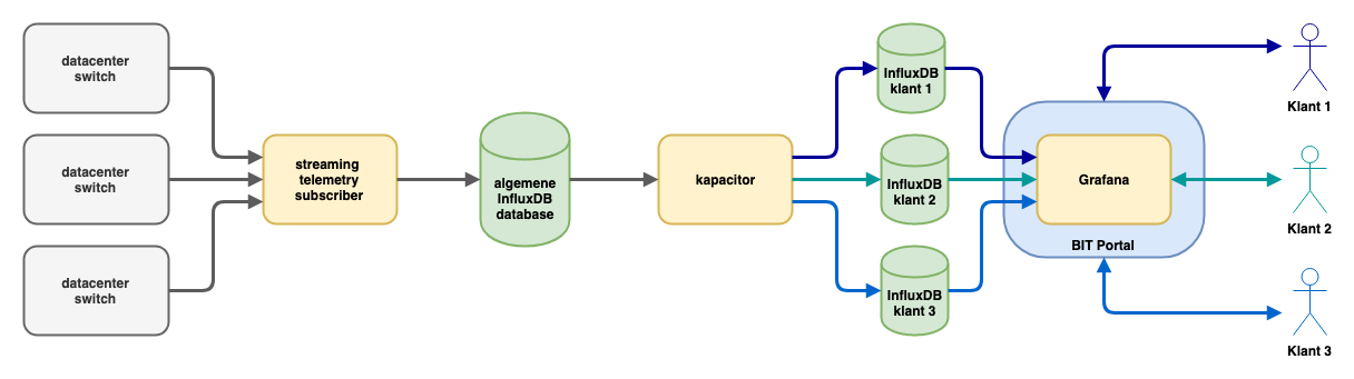
Visualisation
InfluxDB provides a way to efficiently store and retrieve a large amount of measuring points, but it does not give you have nice graphs. Fortunately, open source tools are now available which produce better graphs than old tools such as MRTG and RRDtool. One is Chronograf, also part of the InfluxDB suite, but at BIT we have chosen to use Grafana. Grafana effortlessly produces beautiful dashboards with graphs, based on data from various types of databases, including InfluxDB. Grafana was already used at BIT to visualize internal measurements, so using this tool for visualizing graphs for customers in the BIT portal was a logical next step.
An additional advantage Grafana provides is a wide range of graph types, making it easier for us to choose a visualization mode that best matches the information the customer is looking for. For example, Grafana offers interactive charts. You can zoom in on a relevant part of the chart, and charts can be automatically updated every few seconds, always giving you the most recent measurements.
However, a number of things had to be arranged to integrate Grafana into the portal. We didn't want a customer who was already logged in to the portal to log in again to view charts. Fortunately, Grafana offers good solutions by inserting HTTP headers.
The second point of attention was safety. Obviously, we do not want customer A to be able to access the charts of customer B. To solve this we use organizations within Grafana. A separate organization is created for each customer. Grafana data sources (the links with an InfluxDB database) and dashboards are all uniquely identified by organization. Grafana's rights model ensures that customers only have access to their own dashboards and data sources.
The third major focus point was the management of dashboards. With the large number of organizations, dashboards and charts, it is imperative to have an automated system to create, update and delete all of these things.
That is why we have built tooling that can automatically produce dashboard configurations based on our provisioning database (which shows which switch ports belong to which customers). For this purpose, templates are used, in which only the customer-specific matters (the data source, name of the switch and the port number) must be entered in order to generate a usable configuration. Dashboards are automatically generated and rolled out to the Grafana servers when changes are made to the provisioning database, to the templates or when new templates are added.
Graph one measurement every five minutes
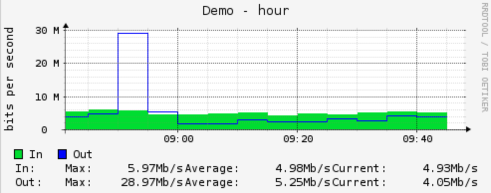
Graph with one measurement every ten seconds

These two graphs show the consumption of the same switch port. On the graph based on one measurement every five minutes, the peak seems to last longer but is lower, while the graph with one measurement per ten seconds shows that the graph was actually short, but much higher. The graph of the errors on the port then shows that this peak led to output discards, an indication that the outgoing port had insufficient capacity to absorb the peak.
New information
By using this entire toolchain, we are now able to make new information available in the portal more quickly. For example, we already provide insight into how many interface errors and discards we measure on switch ports. In the short term we plan on adding historical insight into the link status.
Such information, from which we also collect many measuring points, makes it easier for customers to detect and further analyze problems with their connection. For example, a spike in data traffic from BIT to the customer, combined with output discards, may be a good indication that there is not enough capacity to absorb bursts, and a switch port that occasionally disconnects from time to time may not be noticed through a monitoring system that only periodically checks the status, but can obviously lead to less availability of the underlying network.
We also plan to open up other types of data via this system. We are currently exploring how we can visualize information about our load balancing service, and we also expect to provide insight into virtual
servers this year.
With all of this we are able to quickly respond to requests from customers about certain measurements or the manner of displaying these
measurements.
Do it yourself?
Streaming telemetry and measuring at very short intervals in a more general sense can provide much more insight into what is happening on a network. If your network equipment supports it (and various brands of network equipment do), it is definitely worth it.
Good tools for collecting measurements are also available for insight into servers: the makers of InfluxDB offer telegraf, an agent which can send measurements to InfluxDB. An alternative is Prometheus. Support for more and more types of hardware and software will become available for both tools, which will give them a central place in the collection of measurement data.
And even if you are not yet able to collect measurements with a higher frequency, the combination of InfluxDB with Grafana can offer advantages. The possibility to quickly create dashboards (perhaps
automated) that meet your information needs can also lead to new and better insights.
By: Teun Vink